Ancestry
Experience Designer · 2018–2019
Building DNA Traits from 0 to 1 and reimagining Family Search around a more modern, approachable experience that drew in a younger audience.
- On Amazon
- #1
- Holiday-week traffic
- 3×
- DNA Traits product
- 0→1
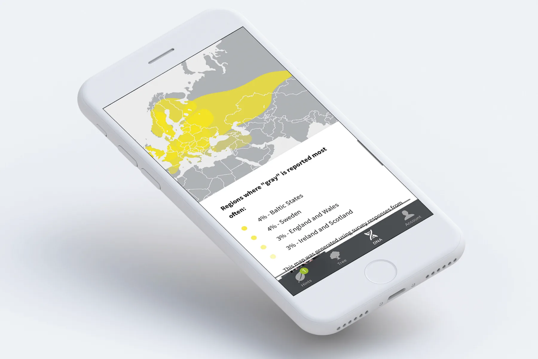
The challenge
Ancestry needed a brand-new DNA Traits product and a Family Search experience that could attract a younger demographic — people who'd never thought of genomics as something fun, personal, or gift-worthy.
The science was rich but intimidating. The job was to turn complex genetic data into a product that felt approachable and genuinely delightful to discover.
The approach
I designed Ancestry DNA Traits end to end — translating dense genetic results into a friendly, exploratory experience that invited people to keep discovering more about themselves.
In parallel, I redesigned Family Search around a more modern, approachable interaction model, lowering the barrier for a younger audience to start building and exploring their family story.
- Ancestry DNA Traits designed from 0 to 1
- Family Search reimagined for a younger demographic
- Complex genetic data made approachable and explorable
The outcome
The more inviting experience helped drive Ancestry DNA to the #1 spot on Amazon and tripled holiday-week web traffic — turning a science-heavy product into a mainstream gift people wanted to share.
The bet
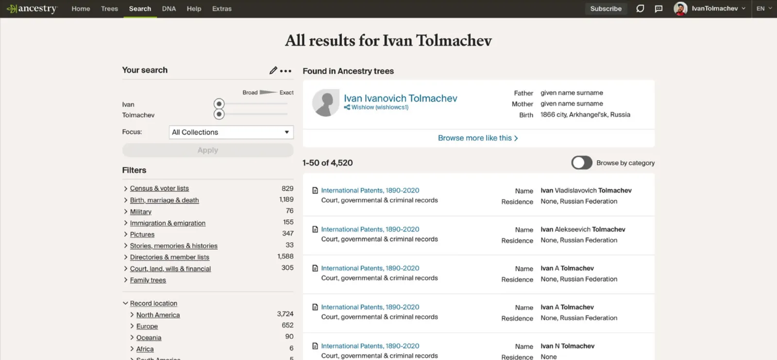
Before Ancestry, I worked mostly as a sole designer in the startup world. When Ancestry decided to bet on biotech to capture a new market and compete with 23andMe, I joined them. This is what their legacy product looked like.
The board's idea was pretty clearly explained in one of Ancestry's own ads. A guy thought he was German, only to find out he's actually Scottish. Now he owns a kilt, has a cool anecdote to share with friends, and a new hobby for family holidays. That's the idea behind the new Ancestry.
So they lease an office in SoMa, hire a science team and start hiring tech workers in the city, while the product still looks like that.
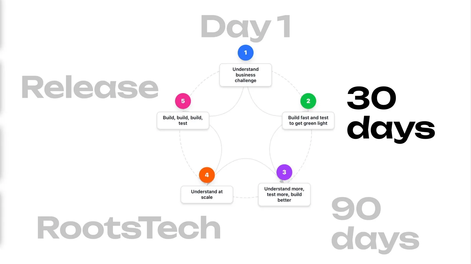
The first 30 days
They hired me for my visual chops, but to start off, my job was to release an MVP: phase zero of a long-term vision of turning a legacy product into a tool of personal discovery and mindfulness.
After meeting the team, we got to drawing, mostly from ideas that came out of board meetings, to put something in front of our stakeholders and have them make their bets quickly. Not ideal, but there's a schedule.
We expected users to want to learn about their health future. We expected to compete with our rivals on science. And we expected users to be self-obsessed, so we wanted to make things personal for them.
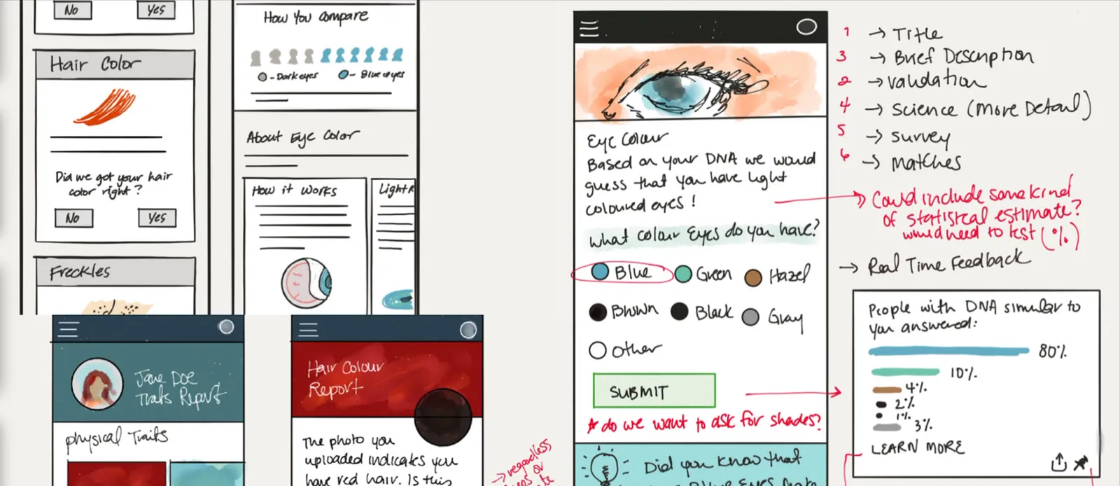
A rigorous sprint got our first attempt at what the product could look like, and how it could work, out the door in about a month. First static, then as something we could put on an executive's phone. A tangible artifact our board and customers could react to.
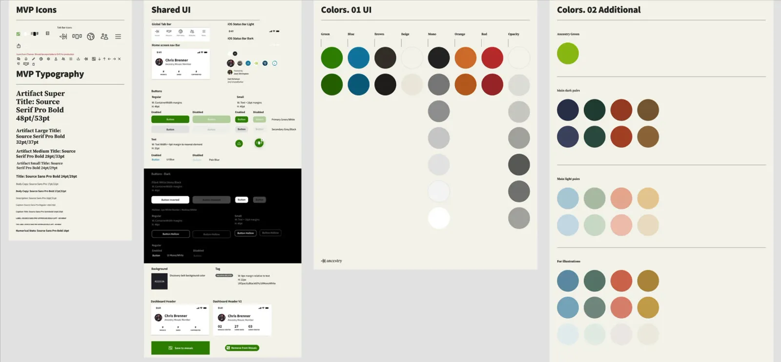
I was also working within an existing UI system, which I slowly departed from as the product became more defined. And the business context was a big bet that everybody at the company was willing to support, which actually made things harder, not easier.
After a month of work, we had a prototype describing a vision, some initial feedback, and a green light from leadership. Now we had a vision to pursue.
Three tracks
When we came back to the office after a break and ideated further, our research team supported us across three tracks: science on feature discovery, engineers on building out the app in code, and other designers on the visuals.
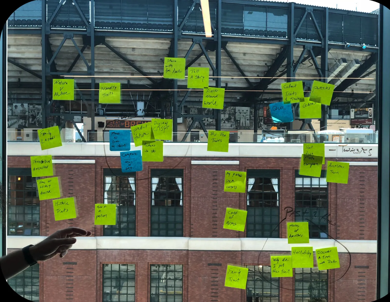
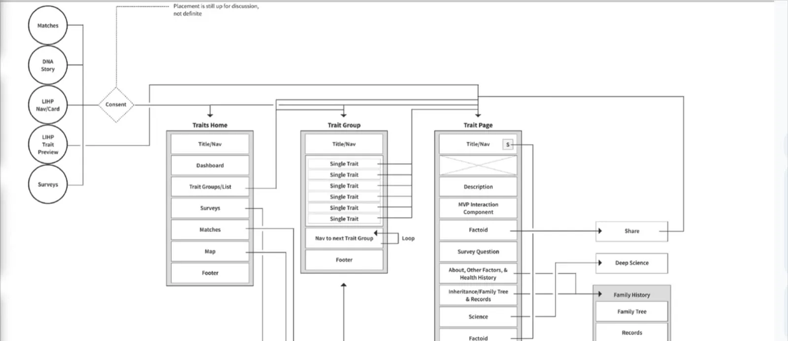
We also wanted to capture enough ideas to present to users at RootsTech, the genealogy conference Ancestry sponsored. Getting leadership to invest in building an app within a few months was a risk, so we needed data from a conference large enough to back us.
Testing at RootsTech
Over the next couple of months we ideated, built out the MVP, and arrived at RootsTech wanting to keep claiming emotional ground against 23andMe. We were going after two audiences, and that wasn't easy.
By the time RootsTech came, we had a clear, emotionally packed vision we could capture user sentiment against. We also had a working prototype, however messy, and a bunch of visual directions and feature ideas. So we started testing.
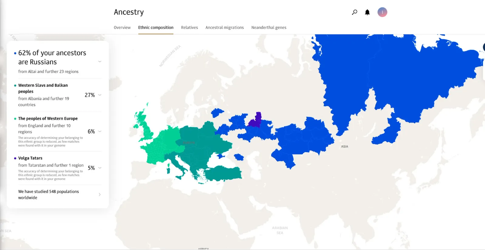
Cartography, migration paths, and ties to your communities and family (not personal traits) were the features users were most fond of, with health choices a strong second. Older people, though, simply didn't want to think too much about health. Genealogy enthusiasts were excited to see their work show up in the context of their origin story.
We needed to build a bridge between people excited about family archaeology and connecting with the living.
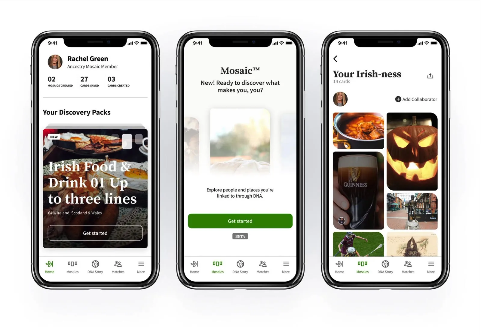
As you can imagine, these insights were absolute gold. We shared them with our product marketing teams and carried on towards V1 with more visual work.
Getting to V1
The design team at Ancestry had many people who came from design agencies, so we had a lot of help and, if I'm being honest, a lot of unsolicited advice. By the time we called V1 done, the brand had gone through a couple more iterations. This is where it ended up, before launch and after.
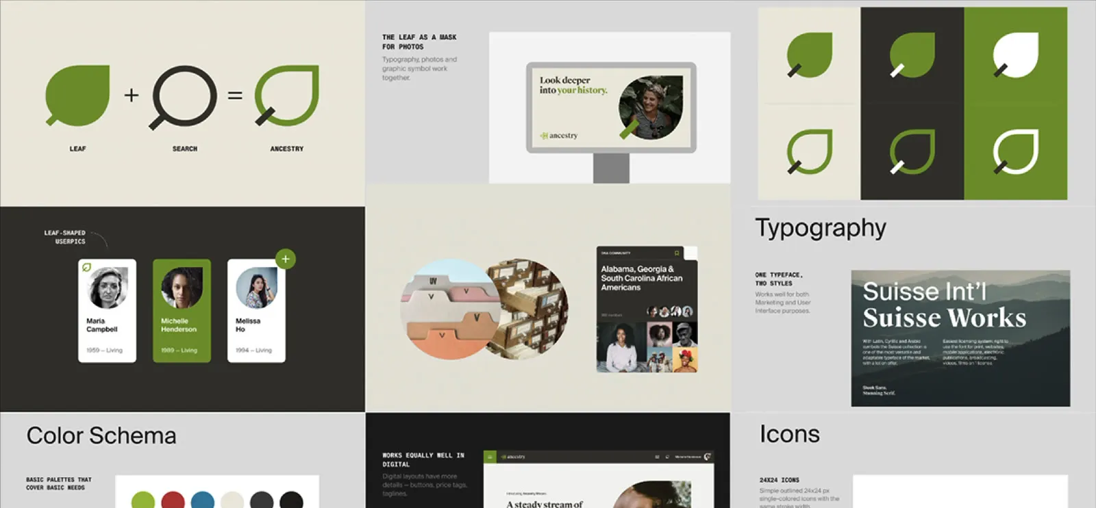
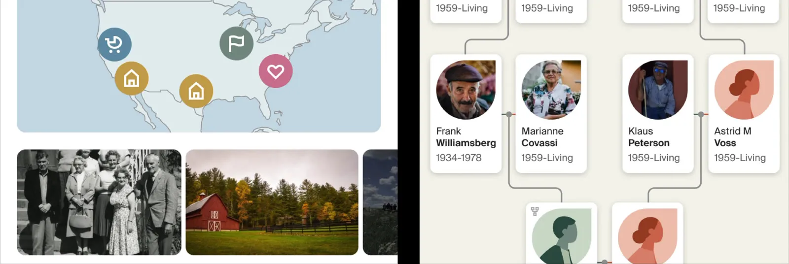
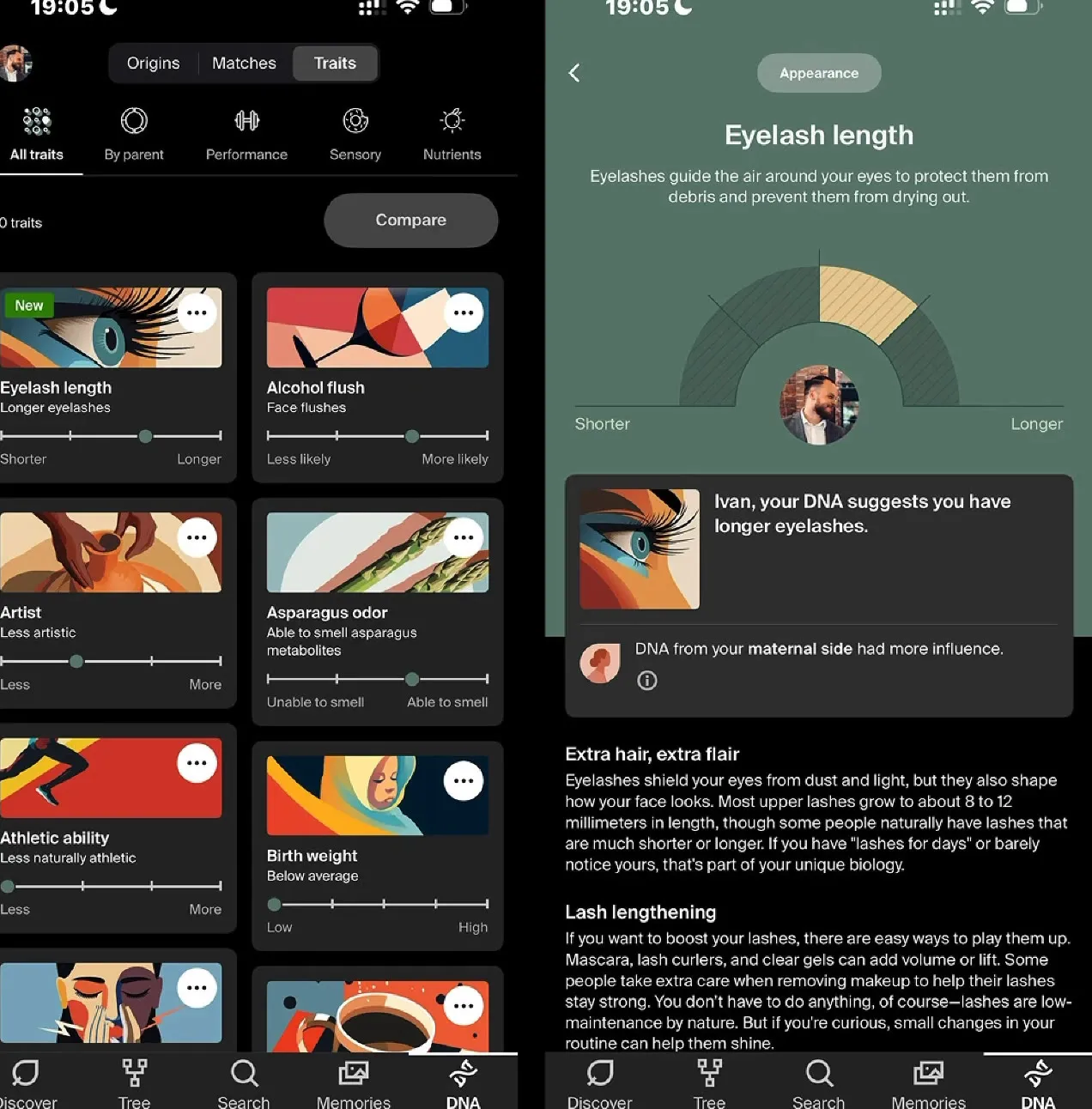
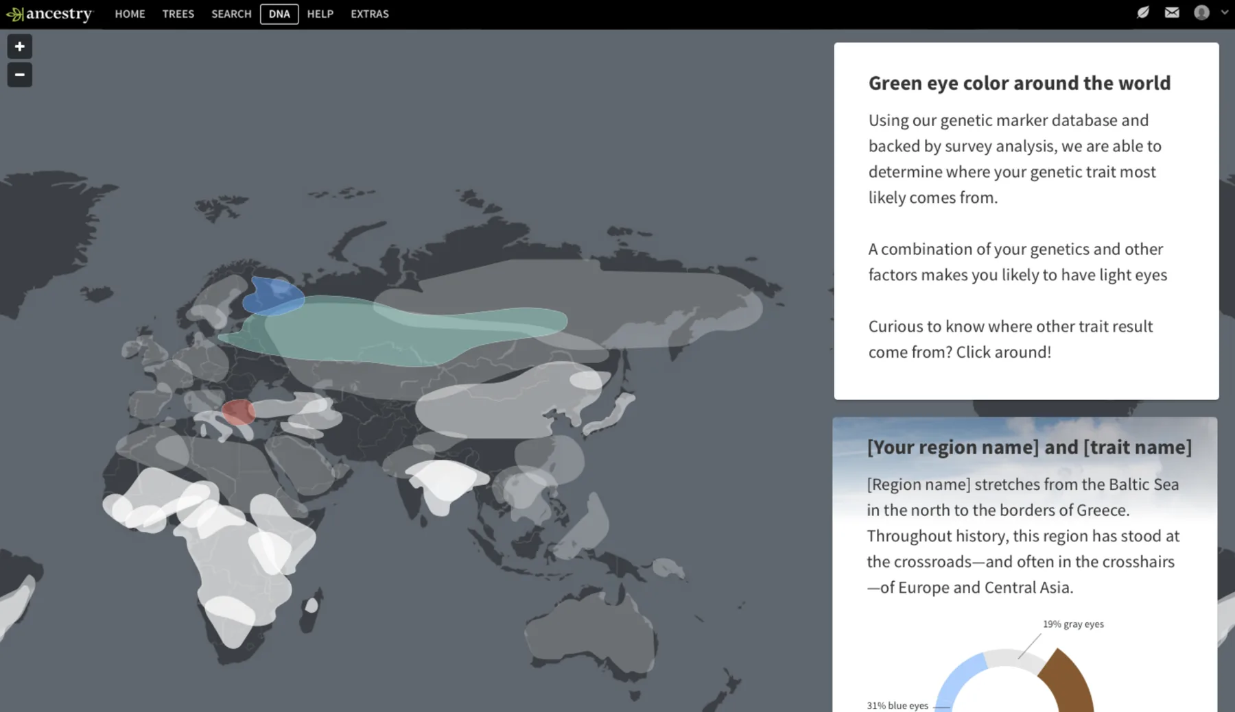
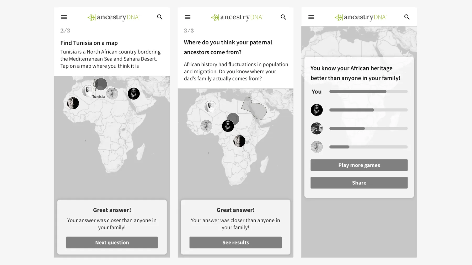
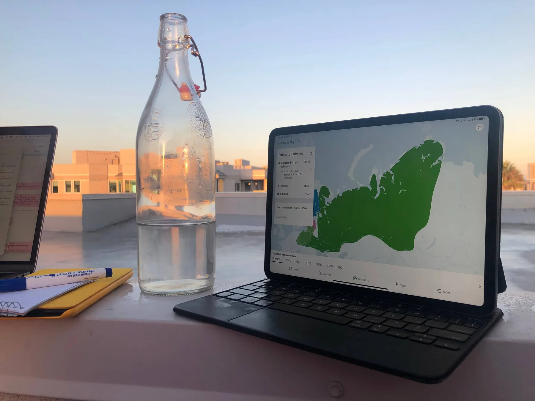
We tested the final product we released with, and more than 75% of our existing customers said the visual resonated with them.
What I took from it
Visual craft is not an event. It's a discipline of scheduled repetition. The result of your visual craft, applied to the problem you're solving, is merely a trailing indicator of how disciplined your team is at pushing out option after option, direction after direction.
How many iteration cycles can you engage in, with enough time to rest in between? That question is crucial.