Finstar
2024 – present
An earned-wage-access app nobody wanted to use. The barrier turned out not to be the interface but shame — and the redesign had to answer that.
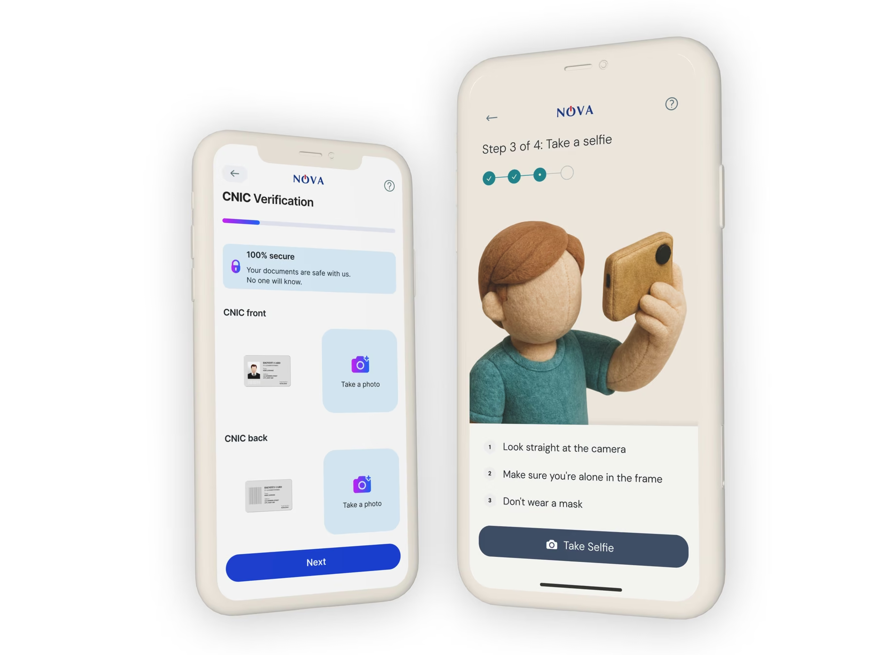
Leading global design strategy and overseeing execution for fintech products across multiple business units, and a strategic marketing unit within HQ focused on brand management and performance marketing. The work is making sure acquired products have a chance at a successful exit, by investing in information comprehension, trust, usability, aesthetics and desirability.
One of the assets was a salary advance service that wasn't reaping the results expected. The goal was to penetrate a lucrative but risky money-lending market in South East Asia. Using the employer as the underwriter, the managers wanted to reduce their financial risk of lending to people who needed money but didn't have a credit history.
For some reason the app wasn't generating enough traction, and we were up against a tight deadline to show results. It was frustrating. South East Asia is home to hundreds of millions of people in demand of the service; the sales team had successfully signed partnerships with businesses in the region, and signups were on par with expectations.
People need our product but don't want to use it. It's ugly and hard to understand.
What could be so hard about loans, I thought — teaming up with a junior UI designer, talking to product owners and existing customers. Although the product worked functionally and the business had its clients hooked, it failed at the most basic thing: understanding why someone would use it.
This wasn't the client's first attempt at a redesign. They had previously invested in usability studies and hired a UI designer to "add colour" to the app. When I suggested we needed to revisit user research, they were sceptical. Having agreed to take a closer look at the UI, I dived into the problem.
Approach
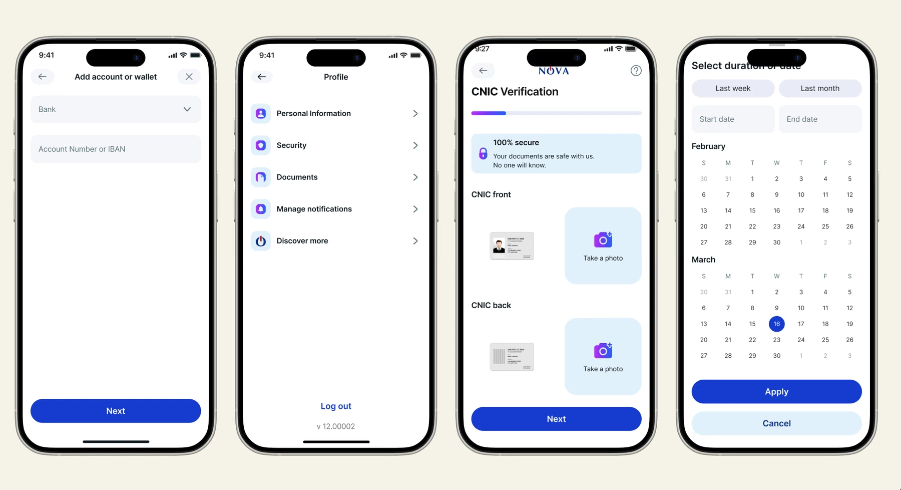
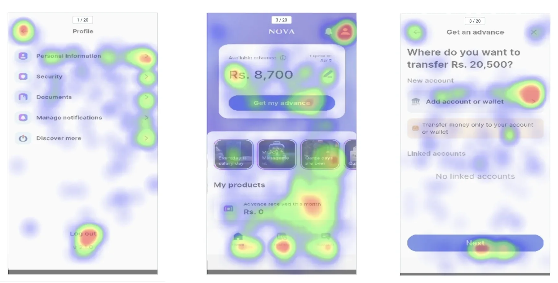
The easiest part of the project was working through the app's usability issues. We installed UX Cam to track user behaviour and improved the screens where we saw the most friction. These changes were no-brainers.
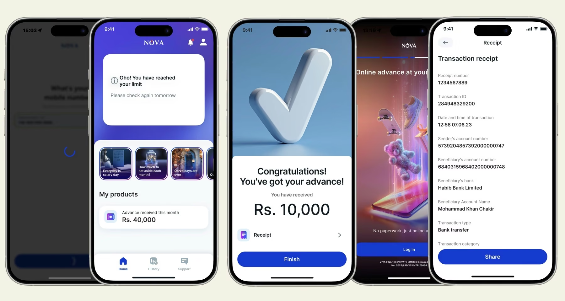
We ran comprehension tests to benchmark understanding of the service, to address a hypothesis support had been seeing: people felt cheated because they didn't understand loan terms when signing up. To improve the metrics we rewrote most of the copy, switched the main font to a more geometric one, and replaced one-off imagery sprinkled through the app with a library of crisp, cohesive icons.
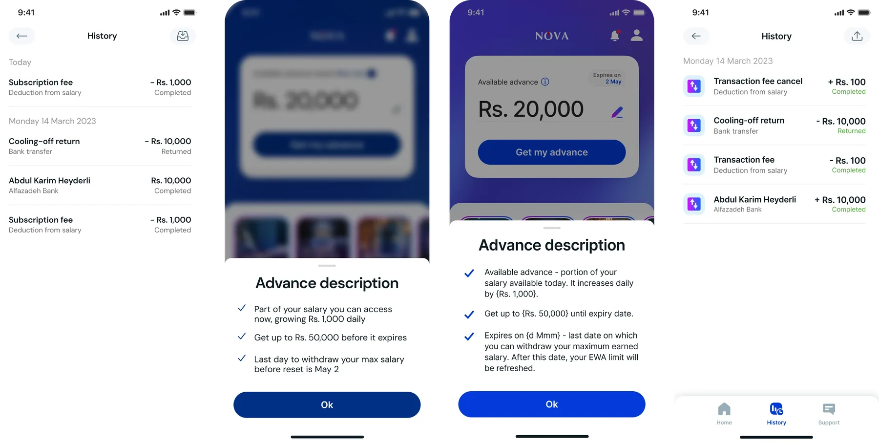
We also introduced sound effects, making key moments like signing a contract or paying back a loan feel more significant at the finish line. This made the app feel more modern — but the underlying emotional problem persisted. The product did not attempt to understand the guilt and fear people felt when using it. We had an idea people needed, and they still didn't want it.
During the initial phase I studied the region's cultural texts and did guerilla-level research with the company's junior employees on Slack who lived in the area, eventually convincing leadership to reconsider studying the underlying factors that were ruining the business.
The key insight: users hated themselves for using us. The product was built without a clue how users felt about the service.
As I probed target users I insisted a product manager accompany me on the interviews. Our conversations focused on the basics — why users needed the service, and how they felt about financial technology like it.
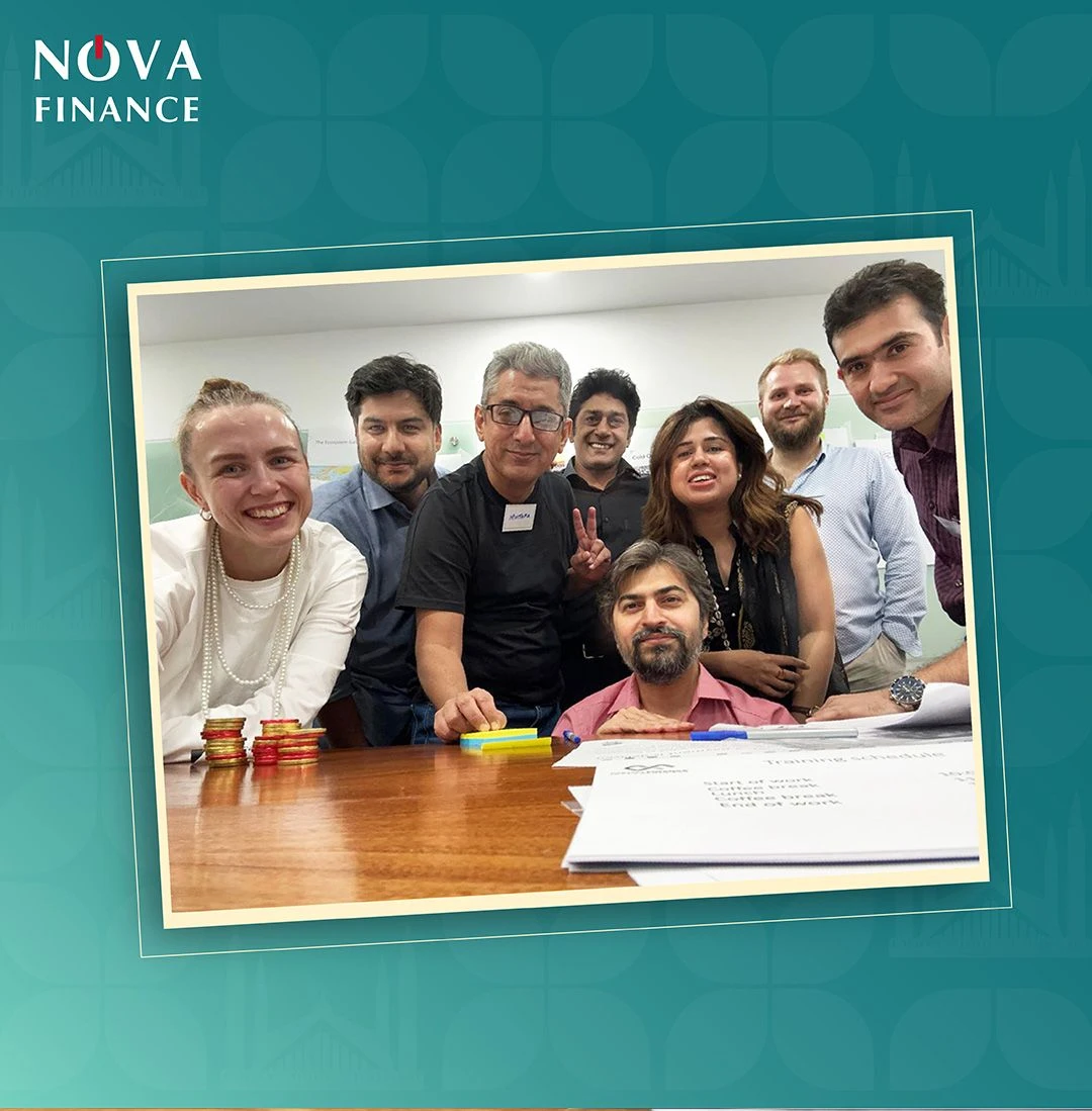
These conversations were tricky and stressful, but they are where the most profound human wisdom gets uncovered. As one user put it:
"I'm glad for my employer to provide this benefit for me. However, I feel that anyone actually utilising it is doing something wrong with their life."
Another crucial insight:
"Whenever I use the service and owe you money, I find it agonising. Getting daily reminders that I owe someone money is hell to me."
So we had a user base whose cultural background saw loans as taboo — something partly shaken off by a younger, less superstitious generation, but the shame of owing money was unmistakable in the study. No wonder customers didn't want to use the app, let alone refer friends and family.
We needed a motivation that would offset the shame and guilt of being in debt. We took inventory: a good business idea, met with resistance from the very user base it was meant to help, and a barrier that was cultural rather than functional. Every interviewee was asked about their daily life and what motivated them to thrive. Two tracks emerged: caring for family, and thriving in their career.
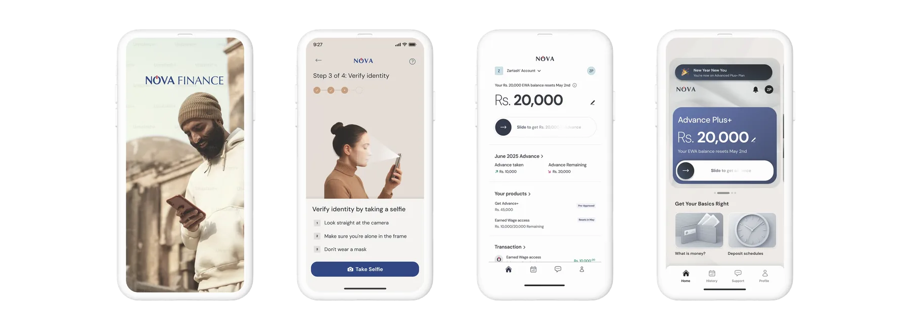
I picked four key screens to redesign with a problem statement in mind: as a user, I want to feel confident about using a financial technology my parents wouldn't approve of. Framing it that way let the design carry confidence, a change of generational guard, a family-oriented and young-professional audience, and the trust that was the product's underlying promise.
Solution
After three weeks of hands-on pixel work I had five concepts spread along a spectrum from self-sufficiency to family focus. We ran quantitative tests with a single question: "Would you tell your father you are using this app to procure loans to pay for unforeseen expenses between paychecks?"
The two that resonated most are below. Users valued a friendly high-tech UI, and the care and comfort the approach conveyed.
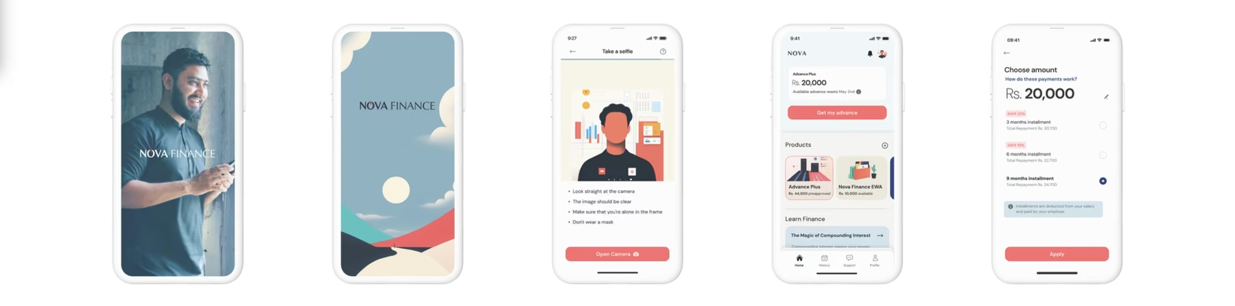
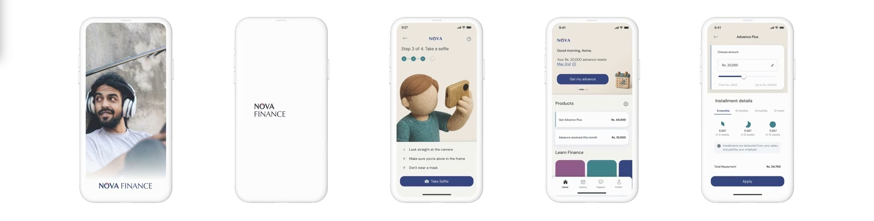
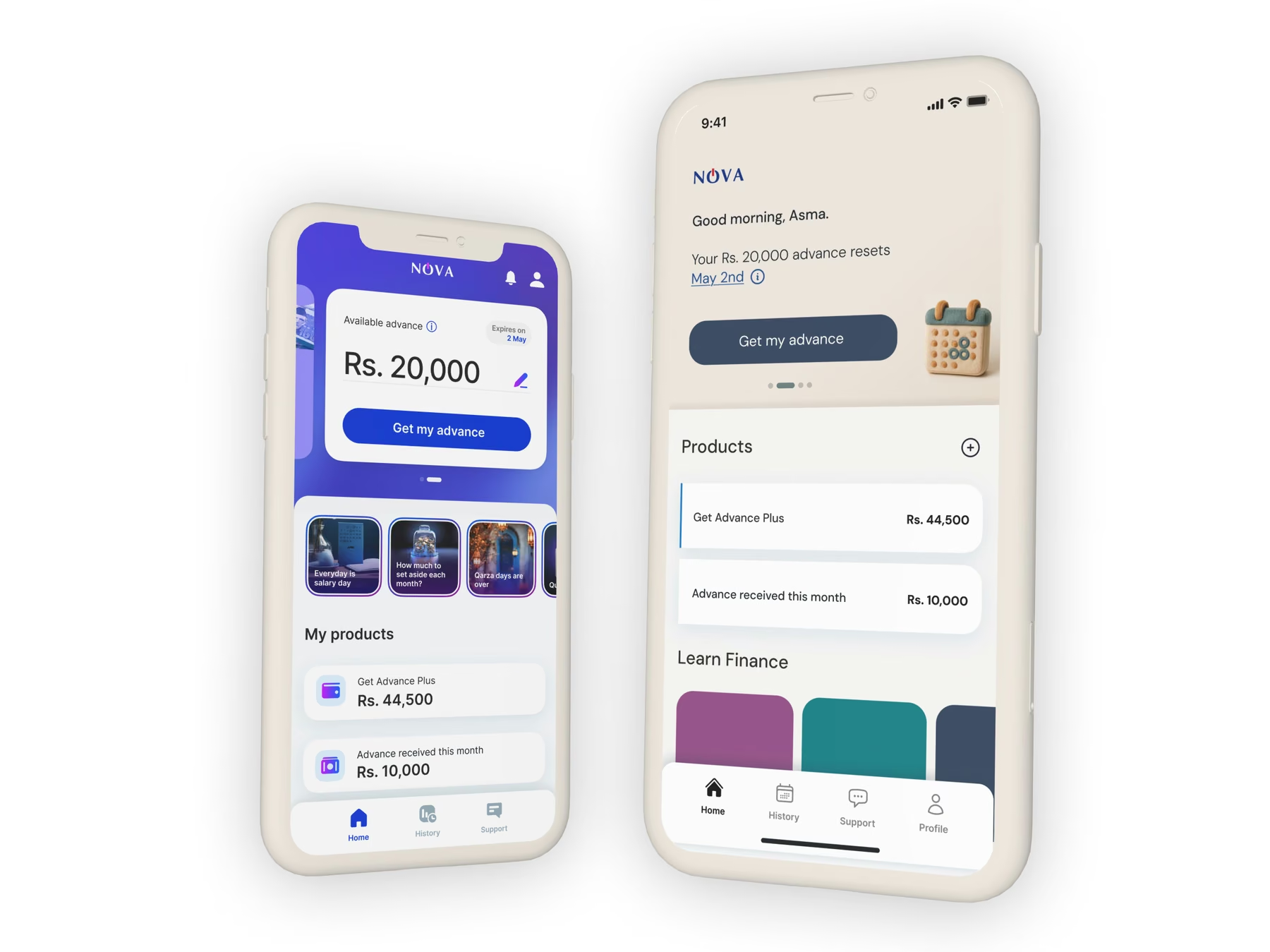
The final interface combined the imagery of caring for loved ones, the feeling of a safety cushion, and the employer's reliability as guarantor. Most importantly, it gave people a reason for taking a loan that they could justify at a family dinner.
"This app inspires trust, everything here is easy and clear. It makes me think of my daughter after a day of hard work."
Result
After the redesign the app saw increased usage. The product was no longer perceived as a dry technology that was nice to have but rarely used; it became a tool of growth and trust between employees and employers, strengthening loyalty and making companies offering an earned-wage benefit more attractive.
The key to it lay not in the technology but in how we connected that technology to the people it was meant to serve — a design that spoke in the language of their values: care, stability and confidence.
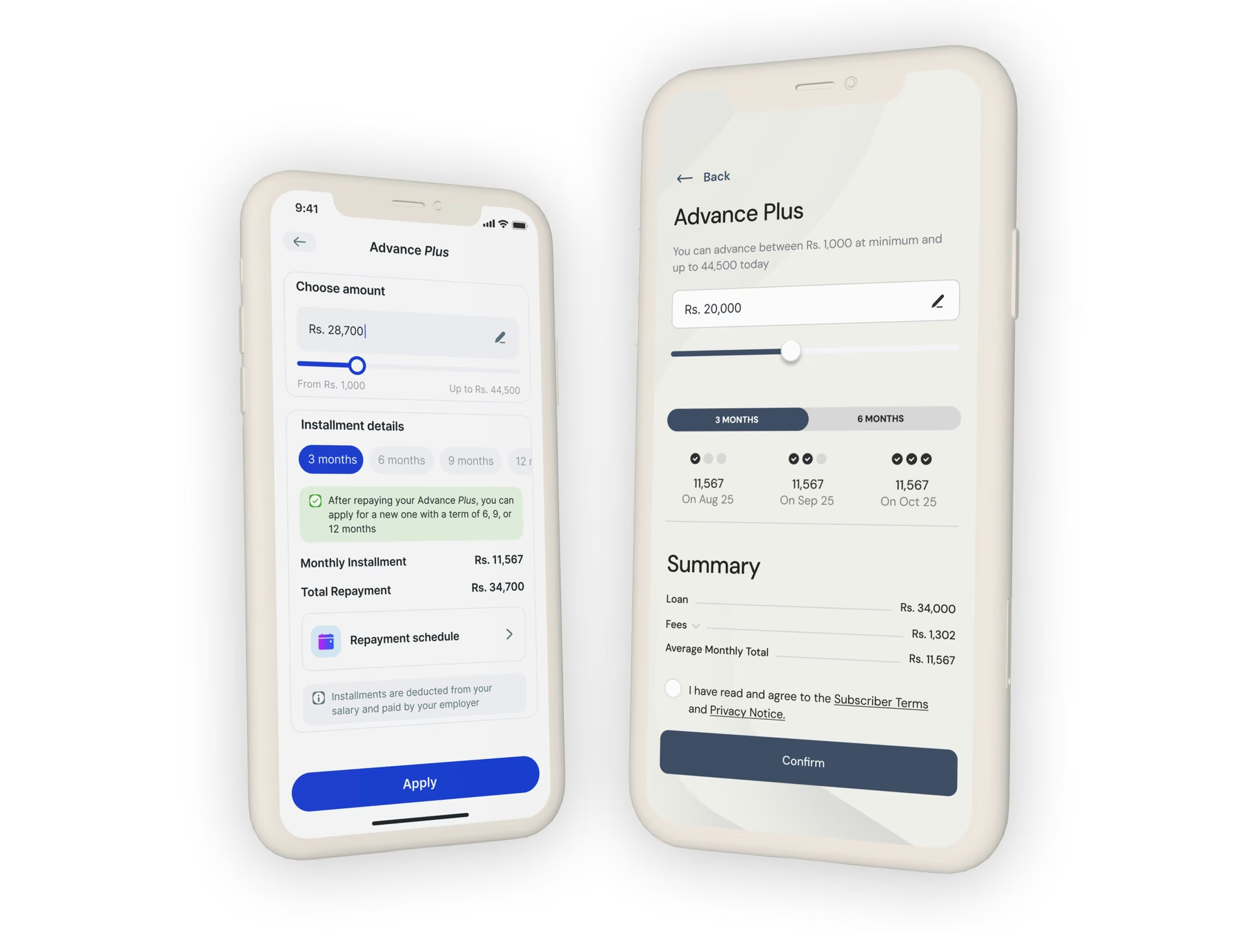
By centring users' biggest concerns we built a peace-of-mind experience that made managing family needs feel secure and approachable. In a region where many live paycheck to paycheck and distrust traditional banks, the technology had enormous potential to provide capital to those investing it the right way.